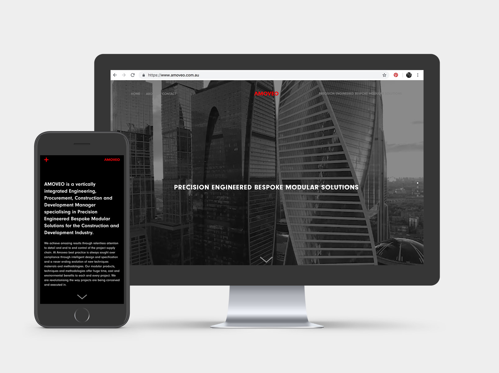


I was approached by Amoveo to work on creating a website and a rebrand for the company. Amoveo are in the construction business and specialise in modular buildings of all types using steel construction.
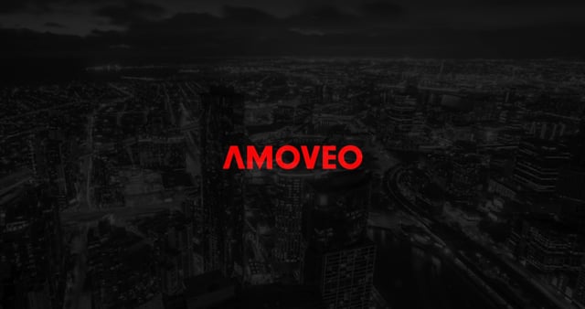
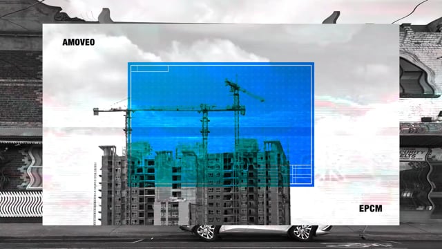
They saw a gap in the market where no one in the construction industry positioned themselves as the dark, bold and exciting. As much as I love Scandi-esque whitewashed wood and neutral inclusive colour palettes, the idea of creating some dark-moody-and-broody was a treat.
Through the idea process I explored jarring video effects and stark contrasting reds. In the end, a cleaner and more deliberate editing sequence won out over the Hitchcock-ian epileptic nightmare of the early ideations.
The video and it’s visual language set the style for the rest of the website layout.
I was approached by Amoveo to work on creating a website and a rebrand for the company. Amoveo are in the construction business and specialise in modular buildings of all types using steel construction.
They saw a gap in the market where no one in the construction industry positioned themselves as the dark, bold and exciting. As much as I love Scandi-esque whitewashed wood and neutral inclusive colour palettes, the idea of creating some dark-moody-and-broody was a treat.
Through the idea process I explored jarring video effects and stark contrasting reds. In the end, a cleaner and more deliberate editing sequence won out over the Hitchcock-ian epileptic nightmare of the early ideations.
The video and it’s visual language set the style for the rest of the website layout.